Component Updates To Design System
This section shows how new components have been developed and updated based on project requirements.
Component Updates To The Design System
One of my roles working on the UI was to come up with new components to resolve specific issues and requirements.
When joining the company the design system had been newly developed. Due to the design library immaturity, many components we’re out of date on Storybook so required updating.
Due to the immaturity of the design system, there was still a need to develop new components that had not been considered. My role was to create these.

-
My Role
Update components not currently fulfilling requirements and discuss with the team
- Create new component templates and styles based on the updated requirements that are suitable for both staff and private sides.
-
Team
Lead UI Designer
UI Designer
UI/UX Designer -
Duration
2 years, items were updated gradually based on project requirements
-
Technical Stuff
Design system - DSM
Components created on Sketch using Craft.
Design Library - Storybook made on Angular
Components based on Bootstrap.
Workload allocation - JIRA
Components And Templates
Updated In DSM…

Below shows some of the additions added based on new requirements.
These include:
- Chatbot icon and window design|
- Accordion header in the table
- Tweaks to tab navigation design
- In-page links
- Header and footer design for staff side
- Tile design for the dashboard seen in the design below
- Range of status tiles.
- Breadcrumb design navigation
- Chat components and many more
Navigation Design Development Journey
When I started designing the navigation header, as not all requirements had been finalised the design developed over time. As a UI/UX designer, it is always important to listen to your users and get clarity on how to use the space available as more features are added.
Feedback from users:
Please see brief details from user testing:
Pros
- Liked how the staff applications and the compliance applications were separated
- They liked that the overall design was similar to the existing navigation used in DB
- They also mentioned that the Home page was clear
- They mentioned that the breadcrumb made sense and helped them understand where they were after navigating various levels
Cons
- They mentioned that the language selector was not very clear.
- The header and footer size dominate the page.
Change in requirements
Business Additional requirements:
- EC policies are no longer required in the header just on the homepage
- Additional applications to be added to header post MVP.
- Timestamp to be added to 1st level of header.
- Raise a query floating button to be integrated into the footer

DB home page originally design was based.
-

Original MVP Design
The original design had applications on the left of the header and staff specific items on the right. We established that this is the standard positon for account items and therefore staff members would already be familiar with this pattern.
Language icon - used in an existing pattern on other sites that display language codes, the justification was efficiency of space.
The breadcrumb design is a standard pattern you see on other sites; the private side is currently using tabs to navigate to other pages.
The “Deutsche Bank GECCo” is based on existing brand guidelines of logo clearance and positioned in the top left hand corner of navigations. The same pattern also applies to the icon on the right.
Dropdown - “View profile” and “Policies” are at a second level as they provide extra details.
The dropdown for language will not close until the user has clicked on a different part of the screen, therefore ensuring they do not select the wrong language.
-

Updated design
As the design developed, new requirements, such as adding more applications in the header, needed to be considered
We decided to move the staff section into the top section of the header to make more space for the main applications. There was also feedback from users that the header and footer were taking up too much space on the screen, so the header and footer height was slightly reduced.
Updates included:
- Removing EC policies - moved into main homepage
- Removing user and language - make use of space in header and word allows clarity on language selected
- Timestamp on first level - business priority compliance requirement
- Badge showing total number of “My queries” de-prioritised due to developer effort.


Tile Design Component…
Component Requirements
The tile was needed as a quick link tool to other applications/pages that the user needed regular access to. This component should be clear to the user and have a high hierarchy on the page. The component will also require a customisable width as it will be used on responsive screens on the staff application, and be a fixed width for the private side.
In order to define a minimum and maximum space, I needed to consider how the tiles would work.
Specific project requirements to consider: The thought process behind this specific scenario is that the tile could be customised based on the user's needs. For example, someone handling stock and trades will use the the the View my Licence & Registrations.


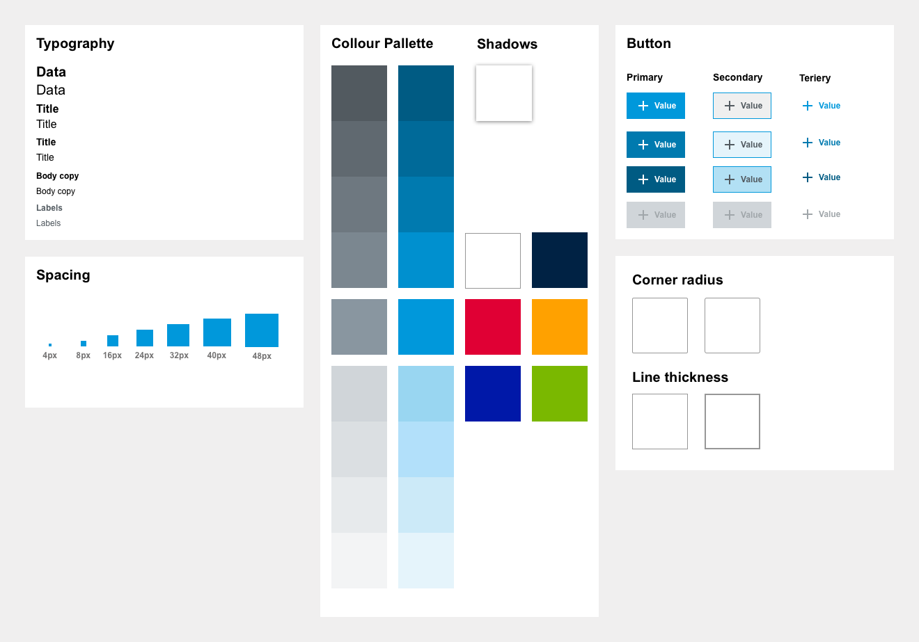
Atomic Design System
I worked on an atomic design system that is made up of “Atoms” that when put together create “Molecules” these Molecules then form “Organisms” and multiple organisms can be used to create templates to create one single page…
This is a common principle in UX/UI design although the system may differ from company to company. Our styles also weave into this principle further allowing that if, for example, we change our active colour all components built will also be updated.


Validating Components Updates In Build
As components are updated in the DSM they then need updating into Storybook this can take time to get right and occasionally requires updates based on technical limitations. Another important consideration when updating an atomic design system, is to check that any design update will not affect any other components or styles.
Giving feedback in JIRA. Each piece of feedback is broken down into individual defects so each defect can be passed or updated. See the example below.
