Outside Business Interest
This application was designed to allow any individual in the business to declare any outside business involvement, or a personal interest that might affect their work.
Outside Business Interests
During this project I worked collaboratively with another senior UX designer, working on aspects of the UX, I also created all the UI required for this project.
Background
This application was already built when I started the project, However, the staff side has not yet been designed. The business had high expectations for this application wanting this application to be a benchmark for the other staff compliance applications. Therefore the business allocated more developer resources to this project.
The Challenge
Staff side: To create an application that allows a user to declare any outside business interests they may have and track the status of the disclosure.
Private side: to vet through and respond to disclosures and track the status and history of any disclosure.
Solution
Deliverables are completed so far as the application is still being worked on.
- Integrating Outside business interests into the Staff compliance homepage
- Single workflow for PIT and OBI.
- Further explaining on questions given to users
- Ability to filter through existing requests
- Ability to save a draft of the questionnaire
- Ability to see answers to previous questions.
- Simple navigation to access other views in the application.
-
My Role
To design a home page UI, explore different layouts and consider the responsiveness of select components whilst using existing DSM library
Private side
Staff SideDeliverables:
- Visual Designs
- Component updates
- Wireframe collaboration
- Responsive breakpoints -
Software
Agile - Work framework
JIRA - organise tickets
Sketch - UI/UX design
DSM - Design Library
Invision - workshops, Prototypes
Invision/Axure - User testing -
Stakeholders and Team
Stakeholders:
Head of UX (Client)
Business owner
Product ownerTeam:
x2 Teams of developers
(1x staff side 1x Private side)
Product Owner - per staff and private side.
UX Designer
UX/UI Designer -
Duration
Home page (staff) 1 yr complete whilst working on other applications along side.
Understanding the Application From Both Sides…
In order to make the disclosure process easier, it is important to align the terminology and structure of certain processes with the staff and private side. One main advantage is using common components when possible to reduce developer effort within the project. The example below shows Similarities in the navigation of disclosures.
-

Staff Side - Listings Page
The Staff member will not need to filter though as many disclosures as the private side, however the filters we’re retained for managers responsible for track the teams disclosures.
The staff side is using a tabbed system to break down the types of disclosures. -

EC Side - Listings Page
The EC side if near identical in filtering disclosure however the interface is different as is being used through an another application.
One key difference is that sections open in a closable table a the top of the screen to allow the user to browse between several tabs at once. As in the staff side the pagination component is adjustable based on the amount of disclosures visible.
User testing
Minimal testing was carried out on this application due to the amount of existing user testing which has taken place on query management, The homepage and Political activity.
Testing was carried out on the questionnaire itself and was positive the only feedback was mostly around adding a save draft for when a user wants to leave disclosure in progress, and easy access editing for already answered questions. which was added post-testing.
Taking Inspiration From Existing Patterns…
Compliance questionnaires can be invasive at times and also use complex terminology. Whilst designing this questionnaire, we took inspiration from a UK census 2021. Thinking about my personal experiences “what does that mean?…” and “why do they want to know that…” I felt reassured as they answered my questions and gave me more detail and clarification. The language used was approachable so made the user comfortable getting more detail.
-

2021 Censes Example
As you can see in this example the accordion is used to expand on the point to give the user context and clarity. A similar pattern was used in our work.
-

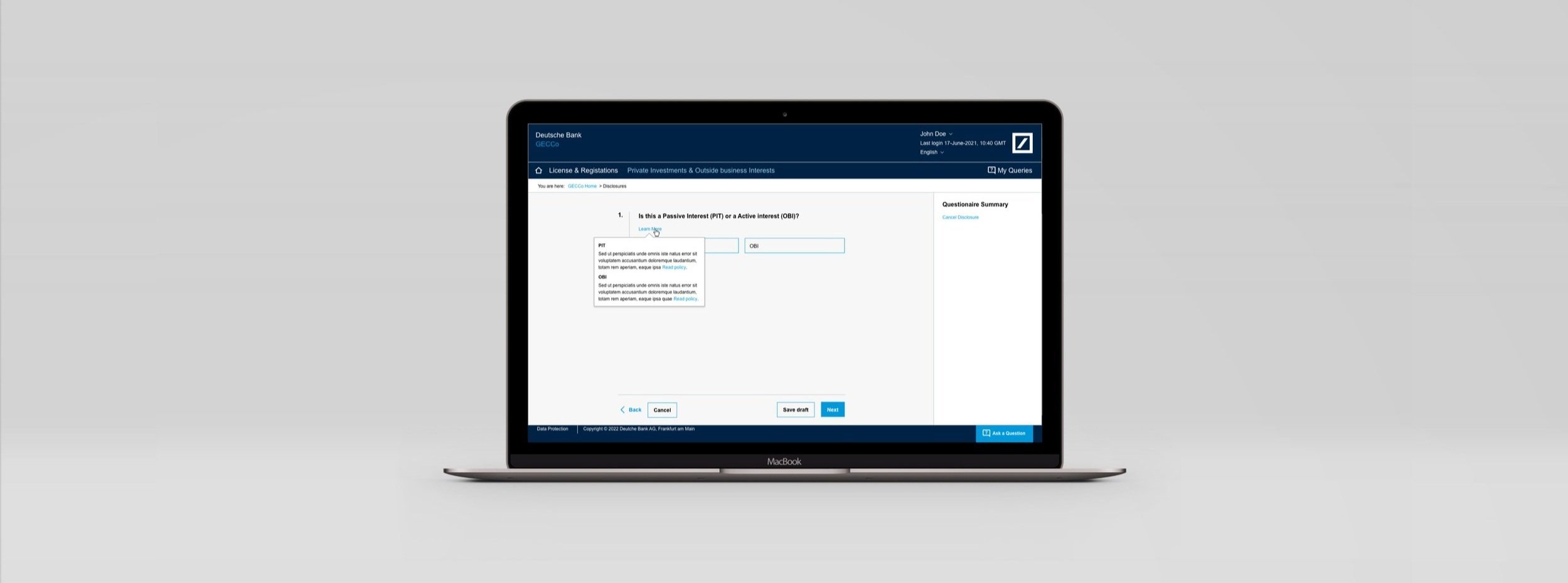
Final Questionnaire Example
Taking inspiration from this design further clarification was given to the user using an existing pattern the user would be familiar with.
The Original phrasing was “what is a PIT or OBI?” but naming was adjusted to “Learn more” based to feedback from business and peers.
Pattern originally show information on hover, but some users mentioned during testing they wanted more detail so a popover was introduced to allow a link to be implemented.
Breaking Down The Disclosure Form Functionality…
See wireframe example of the functionality of the questionnaire form.

Making the questionnaire simpler
See designs created for the PIT OBI project. These screens allow the user to create new disclosure requests for either PIT or an OBI
using one single work-stream that adjusts the pathway based on response to questions.


Here’s My Design Process Summary…
-
Empathise
The user could be any employee working in DB. This could be someone working in reception to the CEO of the company. Some will be using this software once a year. Others once a week… Managers also needed to use the application to monitor their teams.
-
Define
What are we trying to achieve?
Staff side: To create an application that allows a user to declare any outside business interests they may have and track the status of the disclosure.
Private side: to vet through and respond to disclosures and track the status and history of any disclosure. -
Ideas
Most ideas for outside business interests were around refining the tools and features used within the disclosure itself such as a learn more feature for understanding complex terminology and making the user flow as simple as possible.
-
Prototype
Overview prototypes were developed Invision when discussing navigation and specific interactions were created in Axure.
All UI and UX designs were uploaded onto invision as the single source of truth for developer and other stakeholders.
Technical stuff
AG grid - Responsive breakpoints
DSM Library - Components, Text styles, Colours
Font - Ariel
Made in sketch -
Testing
Minimal testing was carried out on this application due to the amount of existing user testing which has taken place on query management, The homepage and Political activity.
Testing was carried out to the questionnaire itself and was positive the only feedback was mostly around adding a save draft for when a user wants to leave disclosure in progress, and easy access editing for already answered questions. which was added post testing. -