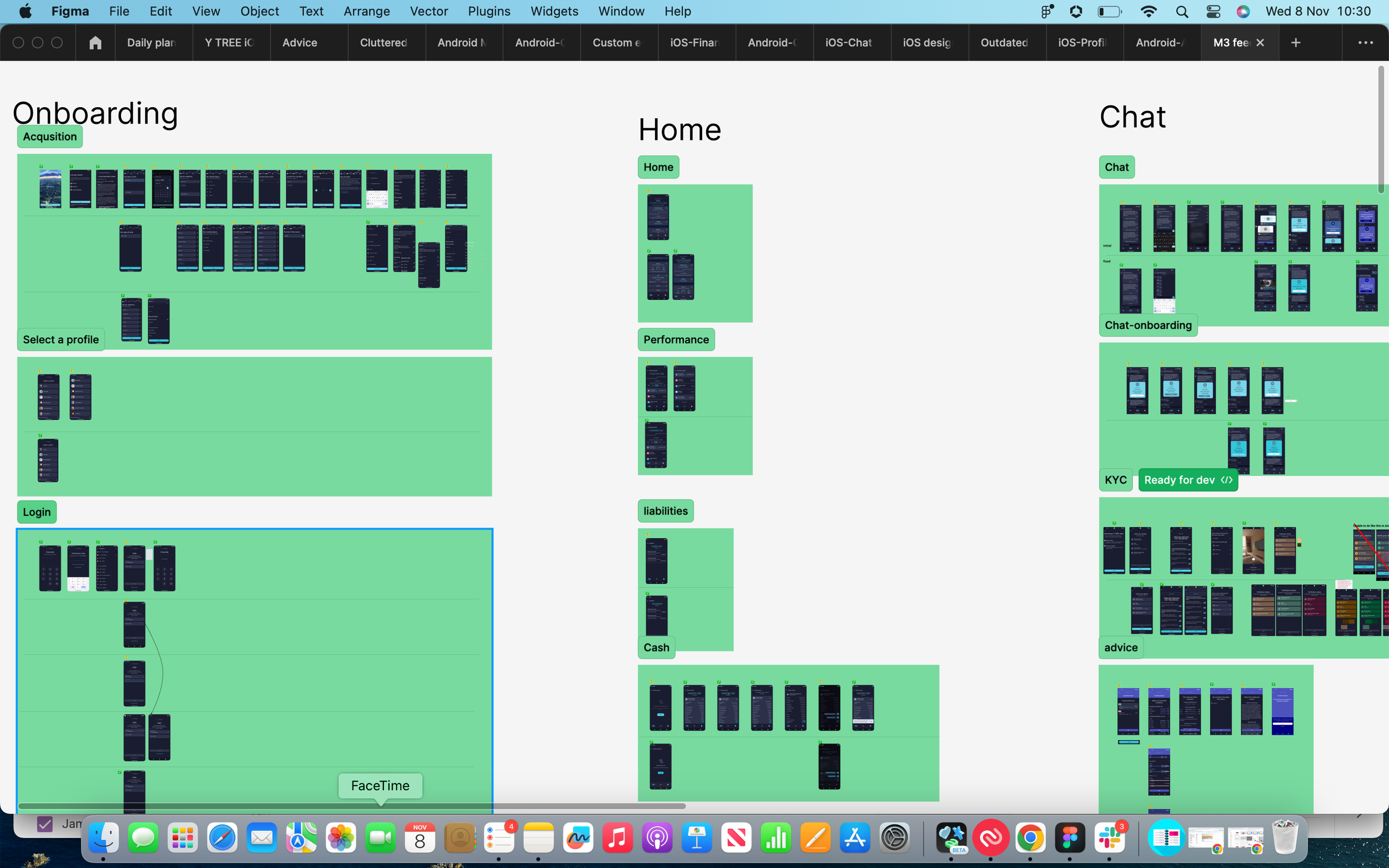
Android migration from M2 to M3

Makes picutre multiple examples of updates in kl way
M3 Migration
Migrating from M2 to M3 significantly enhanced the efficiency and consistency of the app. All elements in the design system became reusable, reducing ambiguity in cross-functional teams and accelerating development by enabling developers to reuse colours, textsyles, components and patterns.
Background
The current design system used Matieral 2 componnents so needed to be translated into the Material 3 text styles, colours guidelines and components and also understand the foundational changes itself. It was important to understand new patterns used expected for certain interacitons users used in other apps. like how to share, download, navigate
M3 standard Documentation https://m3.material.io/foundations
Material 3 Design kit: https://www.figma.com/community/file/1035203688168086460
The Challenges
There was also some backend limitations that had to be considered in the project.
Colour challenges
- Using the M3 theme builder while preserving our brand identity presented challenges. The tool adjusted colour hues for accessibility, requiring a balance between accessibility and maintaining our distinctive brand and core colours
Component challenges
- Integrating our current text styles into the new M3 text style kit involved auditing the entire app for each text style, assessing potential issues with adjusting size and thickness
Component challenges
- Striking a balance between native and bespoke requirements: Our strategy leaned towards a more native approach however there were times when a component did not exist to meet our specific needs, in these cases we needed to audit the use cases and find the most User friendly and scalable solution.
Colour updates
xxxxxxxxxxx
NEW!!!!!!!


Make it stand out
Whatever it is, the way you tell your story online can make all the difference.
Old colour pallette
This project required thinking how to logically visualise how well a user cash health was this needed to be simple to understand but also give clarity .


X
Implementation and validation throughout the app
Upon finalising the updated design system, developers and designers collaborated. Developers implemented updates, and designers validated, gave feedback and adjusted designs. Some designs required restructuring, while others underwent straightforward updates.
During this process, common patterns were established for error states, loading, success, and screens used throughout the app.


-
My Role
To create a new feature which involved updating cash feature and creating new cash efficiency section to help user quickly understand if they are holding a healthy amount of cash in all there accounts.
-
Software
Agile - Work framework
JIRA - organise tickets
Figma - Designs, Prototypes,
Mobbin - Competitor research
Workshops - Miro and Figjam -
Stakeholders and Team
Stakeholders:
Head of Product
Product owner
Head of TechTeam:
Teams of developers
Product owner
Head of iOS
Head of android -
Duration
Designed and built in on 1 quarter whilst working on other projects.
-

Colours
This feature involved updating the existing cash section in the app to notify users of how much liquid cash they have available.
-

Textstyles
This project required thinking about how to logically visualise and organise collative financial data of all a users financial assets. This project required updating the homepage and most used screens in the app.
-

Components
The current feature for company options was very complex and was only used by a handful of individuals, I was able to get feedback from these user to simplify and improve the feature.
Colour Accessibility updates
Thttps://m3.material.io/foundations/accessible-design/design-to-implementation
DEMO IMPorvemnet to accebility on app screens ‘ticks” colout contrast - larger text etc……

Components
Understanding the documnetation
Thttps://m3.material.io/foundations/accessible-design/design-to-implementation
DEMO IMPorvemnet to accebility on app screens ‘ticks” colout contrast - larger text etc……
Textstyles
Colours

mapping out other screens in the app. - stress test!!!!!!

Home screen

Old design system
Whatever it is, the way you tell your story online can make all the difference.
New design system
Whatever it is, the way you tell your story online can make all the difference.
Profile

Old design system
Whatever it is, the way you tell your story online can make all the difference.

New design system
Whatever it is, the way you tell your story online can make all the difference.
-
Learn
Learn the limitations, expectations of M£, development and the business
-
Define
What are we trying to achieve?
Staff side: To create an application that allows a user to declare any outside business interests they may have and track the status of the disclosure.
Private side: to vet through and respond to disclosures and track the status and history of any disclosure. -
Adjust and test out
xxxxxxx
Financial assets

Old design system
LABEL PICTURES!!!!!!!

New design system
Whatever it is, the way you tell your story online can make all the difference.
-
Empathise
The user could be any employee working in DB. This could be someone working in reception to the CEO of the company. Some will be using this software once a year. Others once a week… Managers also needed to use the application to monitor their teams.
-
Define
What are we trying to achieve?
Staff side: To create an application that allows a user to declare any outside business interests they may have and track the status of the disclosure.
Private side: to vet through and respond to disclosures and track the status and history of any disclosure. -
Ideas
Most ideas for outside business interests were around refining the tools and features used within the disclosure itself such as a learn more feature for understanding complex terminology and making the user flow as simple as possible.
-
Empathise
The user could be any employee working in DB. This could be someone working in reception to the CEO of the company. Some will be using this software once a year. Others once a week… Managers also needed to use the application to monitor their teams.
-
Define
What are we trying to achieve?
Staff side: To create an application that allows a user to declare any outside business interests they may have and track the status of the disclosure.
Private side: to vet through and respond to disclosures and track the status and history of any disclosure. -
Ideas
Most ideas for outside business interests were around refining the tools and features used within the disclosure itself such as a learn more feature for understanding complex terminology and making the user flow as simple as possible.
m2 to m3
show huge screen of updates